No products in the cart.
Graffiti Highlights

All the Chapters
How to make Graffiti highlights
MAKING PIECES POP SINCE THE 70’S
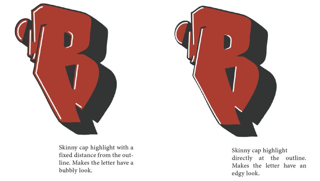
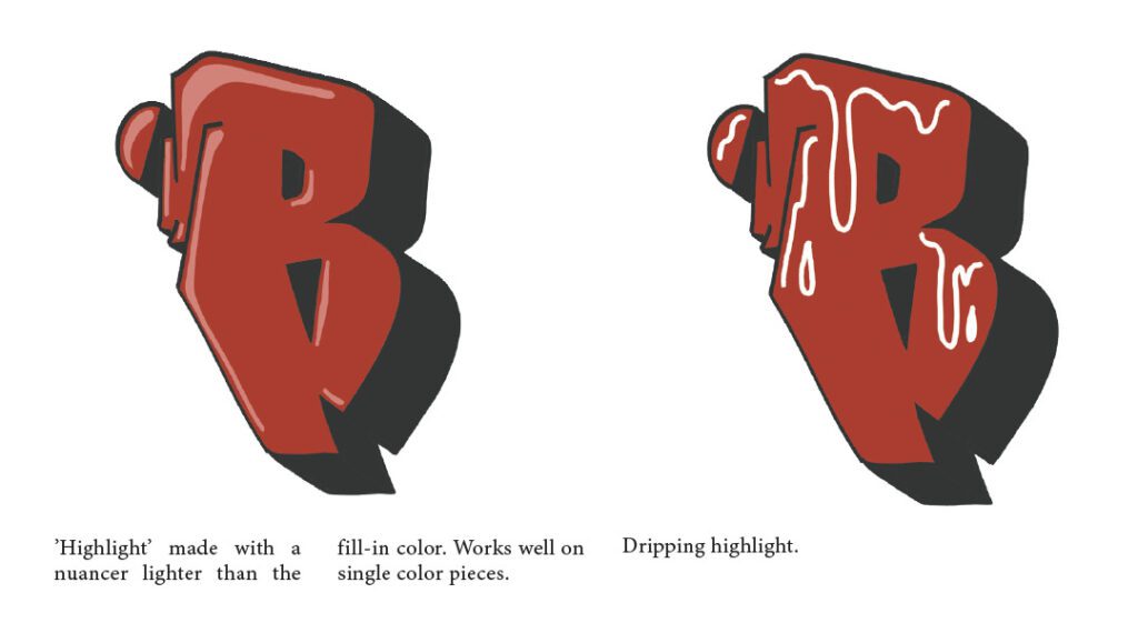
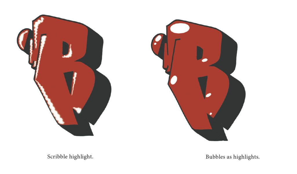
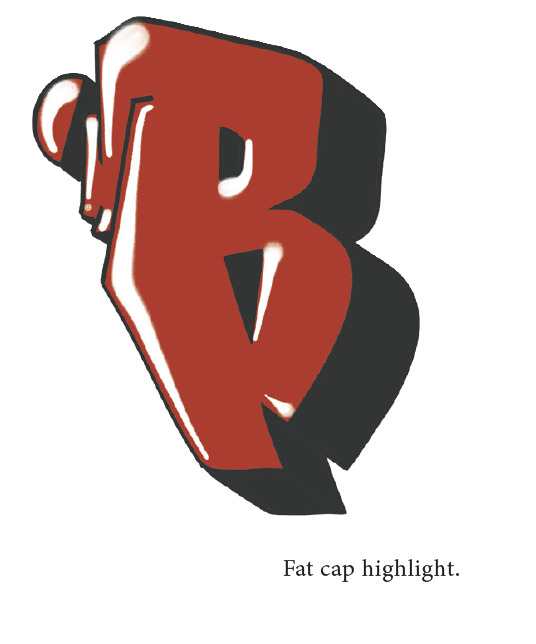
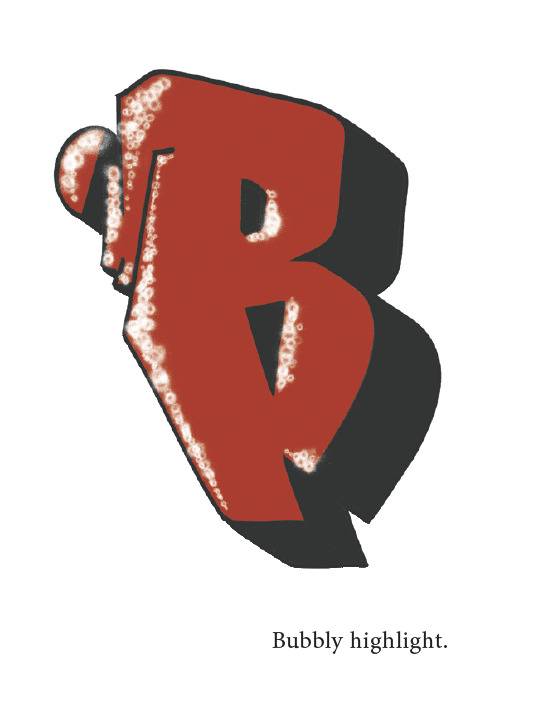
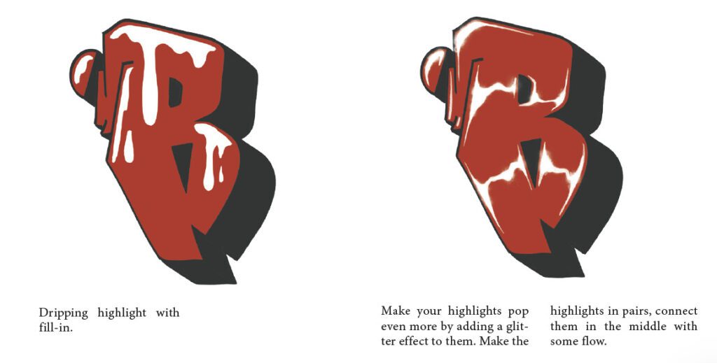
Highlights are, what makes a piece or throw up shine and can transform a mediocre piece into a fantastic one. When adding high-lights, you should imagine that your piece is being lit from a certain angle. The light can come from anywhere you prefer, but stick to only one angle. Adding several light sources makes your highlights look unlogical. When making highlights on your letters, you have to imagine, they should be made next to the outlines that the light touches “first”. If you keep this in mind, you will never have trouble figuring out where a highlight should be put. Highlights should be added as the last step to your piece or throw up, since the flares and stars you can add on top, will make it difficult working or correcting stuff in the underlaying layers.
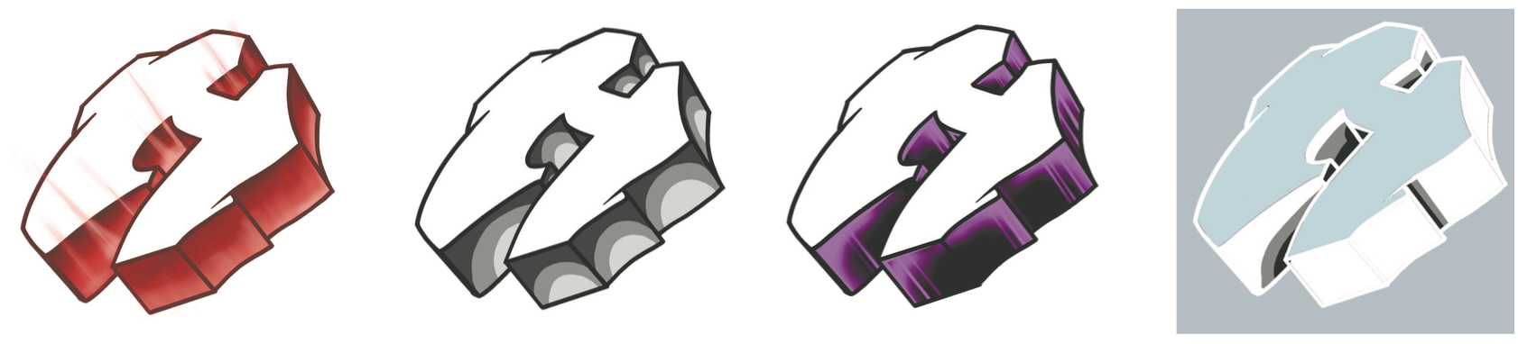
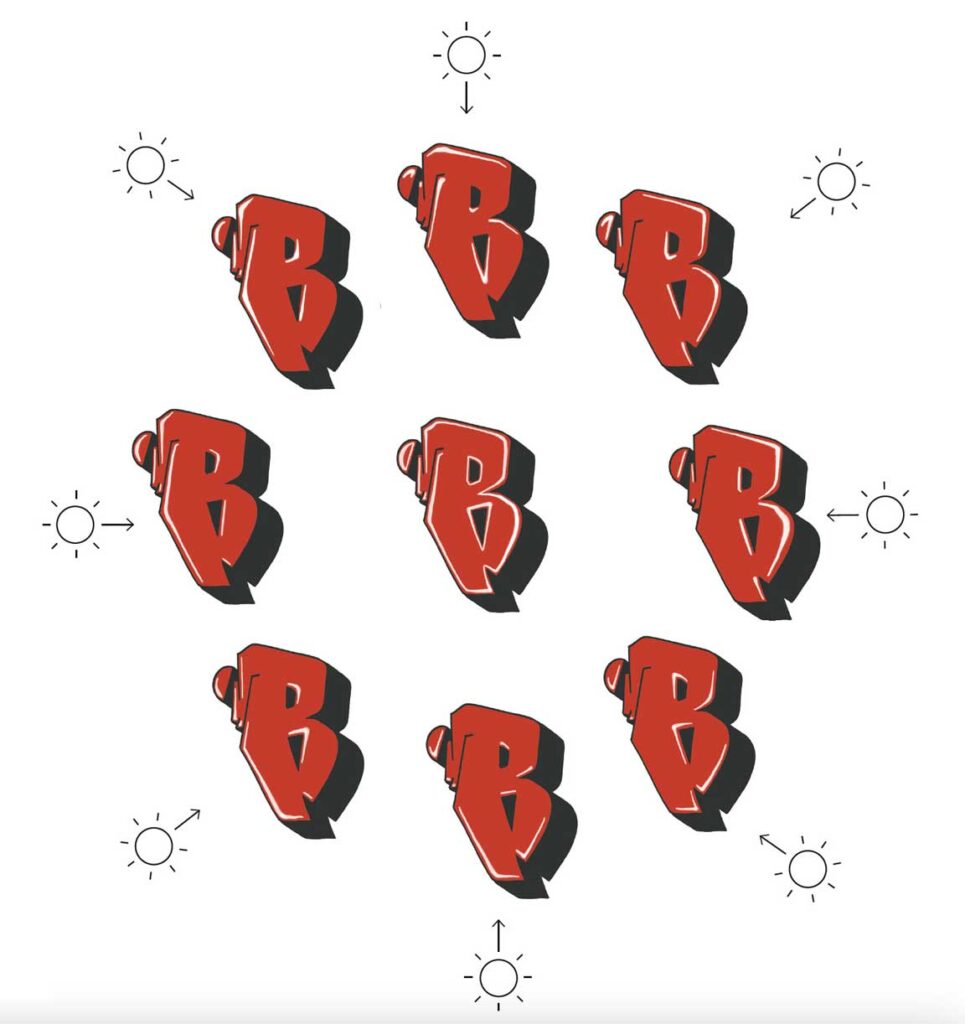
WHEEL OF HIGHLIGHTS
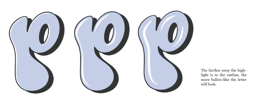
Here you can see the letter R being lit from 8 angles, and the highlights that appear from this. A highlight can be added next to the outline or a bit away from it. The further away your highlight is from your outline, the more round and bubblelike the letter will look. Adding highlights around holes in letters can be tricky because it seems like it’s the opposite side of, where you normally would put the highlight. If you are in doubt where to put your highlight, you can revisit the wheel of highlights. The shadows in this example does not follow the light as shown on the wheel of shadows. Your graffiti does not need to be theoretically correct as long as it looks good.
Do you want to learn more about graffiti highlights and how to paint them on a real wall? Check out our course “GRAFFITI FUNDAMENTALS” teaching just that right HERE
If you want to see a writer using different types of interesting graffiti styles check out the blogpost form Montana Colros right HERE
Related Guides